
Cracker Barrel: A Rebranding as Part of Strategic Brand Planning
A Rebranding as Part of Strategic Brand Planning
The internet is flooded with takes on Cracker Barrel’s new logo. Honestly, probably more than it deserves. But it does raise an important question: what happens when rebranding, as part of strategic planning, brushes up against brand heritage?
Why This Shouldn’t Be Treated as a Brand Repositioning Effort
Cracker Barrel didn’t reposition the brand. A brand repositioning strategy means changing the mental space a brand occupies in the consumer’s mind relative to competitors - altering the promise, the target, or the value proposition. That wasn’t the case here. The company is still about country hospitality, comfort, and community. This was a rebrand within a broader brand strategy plan, not a repositioning. And that distinction matters.
Brand Evolution
Cracker Barrel has refreshed its logo several times in its history:
1969–1977: The original “Old Country Store” typeface, a bold Western-style wordmark without illustration.
1977–2006: The introduction of Uncle Herschel, seated by a barrel, paired with a rounded yellow wordmark. This version cemented the brand’s visual identity for nearly 30 years.
2006–2015: A refined look, with cleaner outlines and darker tones, but Herschel and the barrel remained central.
2015–Present (before update): Subtle tweaks again — streamlining lines and adjusting proportions for consistency across signage and print.
2024 Rebrand: The most radical shift. Herschel disappears from the lockup. The barrel and wordmark remain, but simplified into a flat, digital-first design for signage, billboards, and mobile screens.
The latest refresh was a part of a wider turnaround effort — modernizing stores, refreshing menus, and reaching younger customers. Officially, the company calls it the “fifth evolution” of its logo since 1969, now simplified for digital and billboard use. “Uncle Herschel remains front and center in our restaurants and on our menu. He is the face of ‘The Herschel Way’… This fifth evolution of the logo is rooted in the iconic barrel shape and word mark.”
But the public reaction told a different story.
Is There a Risk of Brand Dilution?
If we treat it as rebranding, then the right questions aren’t “is this on-trend enough?” but “does this modernization preserve the distinctive assets that fuel memory?”
Because brand building is a memory building game.
When you retire or weaken a distinctive brand asset, you risk sliding into brand dilution — and that’s where the danger lies.
So, what’s the right process? If you’re refreshing identity as part of strategy planning, there’s a bare minimum of work you’d expect to see.
Drill into the archives to understand the backstory, heritage, and roots
Talk to loyalists because they carry the flame
Run ethnography in-store to see how symbols, design, and rituals show up in real behavior
Measure the uniqueness of the logo so you don’t drop something that carries the brand in customers’ memory
Do perception analysis to uncover the good, the bad, and the ugly
Run a competitive audit to understand why customers choose you over alternatives
That’s the foundation of a responsible rebrand.
Why a Logo Is Not Just a Logo
Simplification is a common path in identity design - most brands modernize for digital usability and audience relatability at some point. But simplification isn’t just about making a logo flatter or cleaner. Without understanding the “why,” you’re not executing a rebrand as part of strategy. You’re just doing cosmetic surgery.
And that’s not the point.
This is why Uncle Herschel matters. He wasn’t a decorative add-on. He was a distinctive brand asset. A living cue, a memory trigger that instantly brought up associations of the experience. Emotions of comfort, southern tradition, familiarity.
And he wasn’t invented in a boardroom! He was founder Dan Evins’ real uncle, the brand’s original goodwill ambassador. He was there from the beginning, and his story has to remain part of the brand’s evolution narrative.
By removing him from the logo, the company didn’t just “simplify.” They weakened an emotional shortcut that built predisposition. That’s how rebranding can drift into brand dilution if not handled carefully.
So yes, in my view, retiring him was a mistake.
Rollout Plays an Important Role in Strategic Planning
The rollout didn’t help either. From the outside, it looked like a file drop, not a staged story. But in brand strategy planning, especially when emotional equity runs deep, a rollout has to guide people through change.
You need a narrative stack: why now, what changes, what endures, what problem this solves, and what it is not.
And you need stages: internal teams and frontline first, then loyal customers, then press and partners, and only then the public reveal.
Without that sequencing, loyalists feel blindsided. And when nostalgia is part of the equity, being blindsided feels like betrayal.
Physical Space as Brand Experience
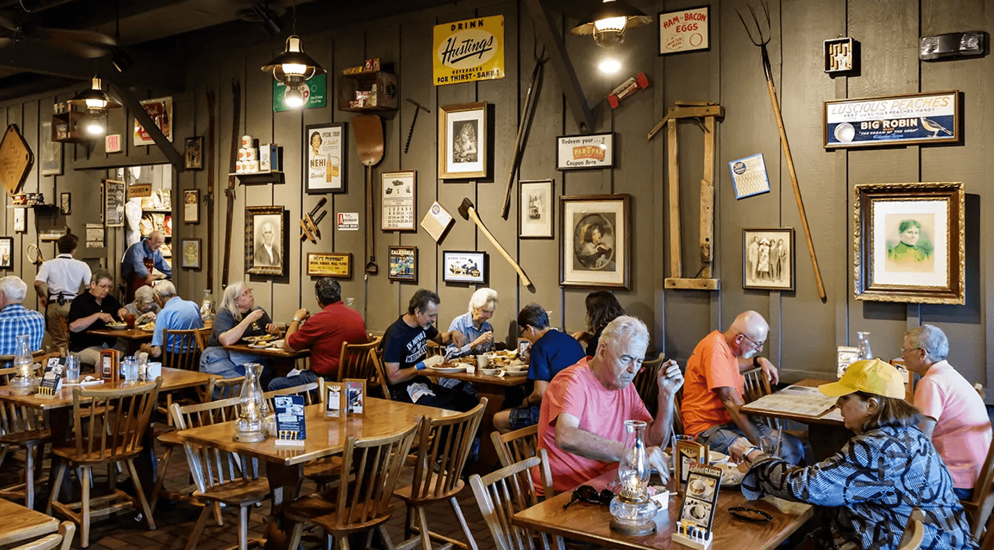
Most of the backlash isn’t even about the logo only. It’s about the experience. Loyal customers say the space doesn’t feel the same anymore. Now it’s more sterile. Less cozy. Vintage Americana replaced with farmhouse chic.
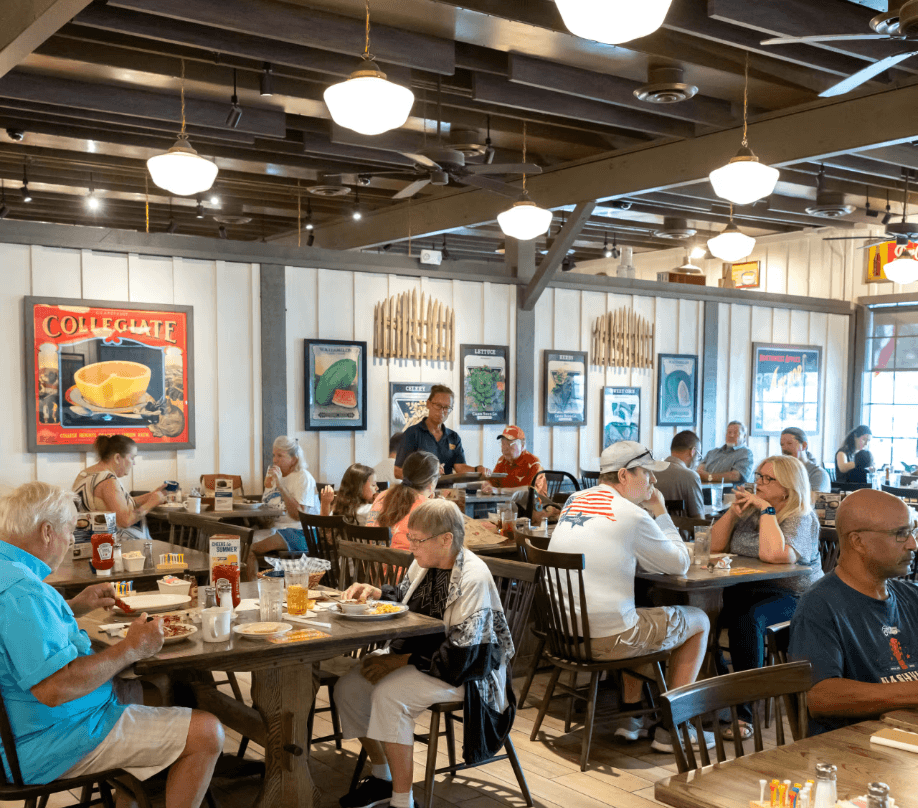
Cracker Barrel executives countered that guests asked for “lighter, brighter, fresher.” Both things can be true. But in branding, perception is reality. And if a core part of your audience feels like the space has lost its character, that’s a strategic miss.
I see it over and over how physical space is the most underinvested touchpoint in brand building. And if you think about it, It’s the only channel that engages all five senses at once, encoding memory faster and deeper than advertising ever could. Done right, space becomes the silent brand ambassador.
Cracker Barrel once nailed this: fireplaces, rocking chairs on the porch, walls layered with generational stories, communal tables stacked with warmth. These weren’t décor choices. It represented the community. Strip them back too far, and you lose the sensory shortcuts that made people feel “this is my place.”
Rebranding that cuts away heritage may look clean in the short run, but in the long run it erodes equity, loyalty, and pricing power. Strong brands win because they are meaningful, different, and salient. If you reduce meaning in the name of modernity, you hollow out what gives you competitive advantage.
And heritage is a competitive advantage no one else can buy.
The Bottom Line
Visual change isn’t about design preference; it’s about protecting and growing equity.
In this case, simplifying the logo wasn’t the only issue. Stripping out Uncle Herschel and sanitizing the brand’s spaces was.
Logos can evolve.
Spaces can be refreshed.
But when you start cutting away heritage and distinctiveness, you’re not updating the brand. You’re emptying it.
Ready to Take Your Brand to the Next Level?
If you’re serious about growth, you need more than a new logo. You need a Brand Strategy Plan - your roadmap that shows you step by step what to do, when to do it, who to involve, and what outcomes to expect.
Because brands don’t evolve by accident. They grow because you know what you are doing.
Get in touch:
support@ledbybrand.com


© 2026 Led By Brand. All rights reserved.
All content, images, and digital products on this website are the property of Led By Brand and may not be used or reproduced without permission.